As you may know, unemployment is one of the most important problems workers have to face. Here you have some charts and graphs that show the official unemployment rates in different countries:
- The first chart refers to the European Union´s unemployment rates in 2004 and 2009. This information is very useful to compare how the economic situation has changed and how unemployment rates have raised in the last five years. You can also compare the differences between the unemployment rates per sex and age groups (younger and older workers):

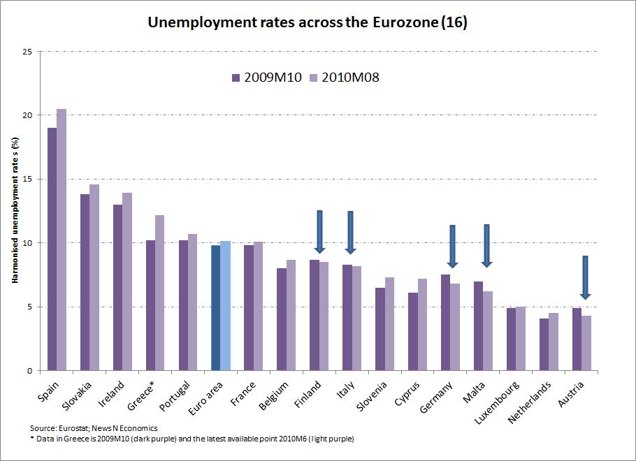
- The following graph shows the unemployment rates in the countries that belong to the Eurozone (the European countries that use the Euro as currency). The data correspond to September 2010. You can compare the evolution of the unemployment rate in the last year in the different countries of the Eurozone:

- This is another interesting graph that reflects the evolution of unemployment rate in the United States in the last two years:

- This is another interesting graph that reflects the evolution of unemployment rate in the United States in the last two years:

- On this link you can find updated data of the evolution of unemployment rates in the different states of the USA:
http://www.bls.gov/news.release/laus.nr0.htm
- And the last link refers to Spain. It explains the process unemployed workers have to follow to perceive the unemployment benefit and the amount of money they will receive in relation with the time they have been working. The link is in Spanish:
http://www.oficinadetreball.cat/socweb/export/sites/default/socweb_es/ciutadans/pres_desocup/prestacio_atur.html
No comments:
Post a Comment